
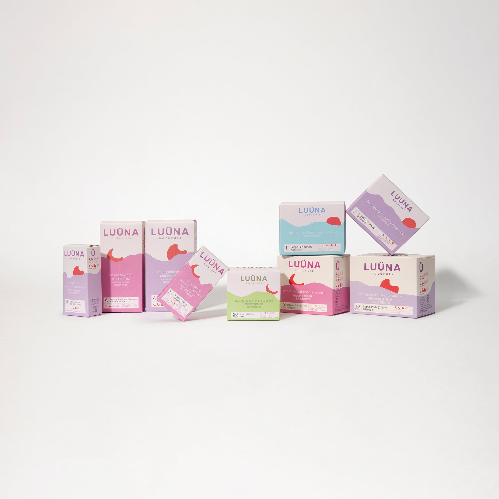
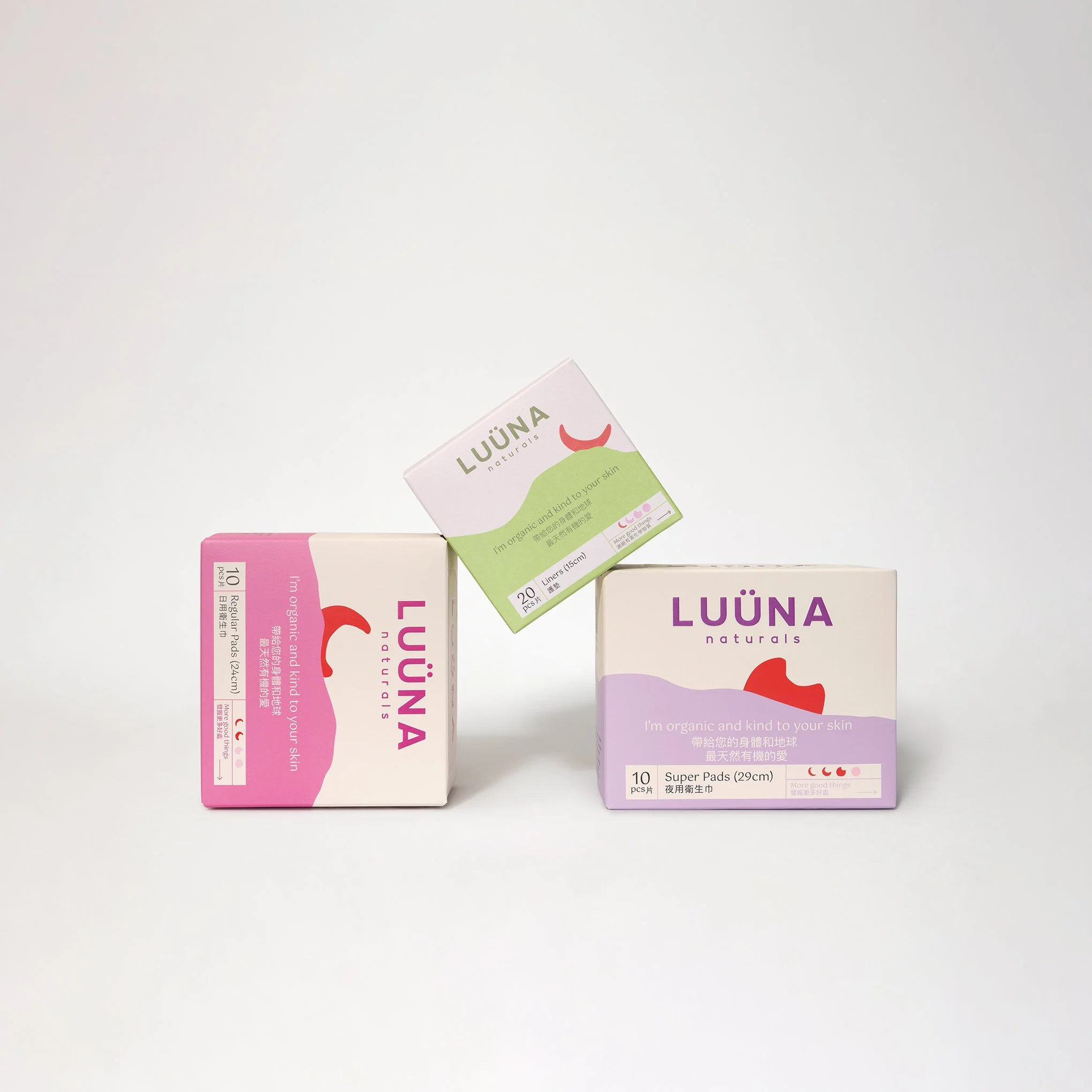
LUÜNA Naturals is a Hong Kong Founded sustainable period brand that wanted to shift its branding identity to appear more credible and trustworthy - while still maintaining its approachble and fun persona. I was the appointed lead designer for LUÜNA Naturals, and oversaw and led the art direction shift, social media posts, and campaign shoots.
LUÜNA Naturalsは、香港発のサステナブルな生理用品ブランドで、ブランドアイデンティティをより信頼性と信憑性のあるものにシフトさせつつ、親しみやすく楽しいキャラクターを保ちたいと考えていました。
私はLUÜNA Naturalsのリードデザイナーに任命され、アートディレクションの変更、ソーシャルメディア投稿、キャンペーン撮影を統括し、リードしました。
Agency: Constant

TYPEFACES
The biggest challenge for me was definitely the language barrier - as I’m not a Cantonese nor Mandarin speaker, let alone understand Chinese typography! I was very lucky to have had a team help guide me through the typography decision and worked together to ensure that both the English and Chinese typefaces.
私にとって一番の挑戦は、言語の壁でした。広東語や普通話を話せないうえに、中国語のタイポグラフィーも理解していなかったので、非常に困難でした。しかし、タイポグラフィーの決定に関してはチームにサポートしてもらい、英語と中国語のフォントが両方とも適切に調和するように協力して進めることができました。


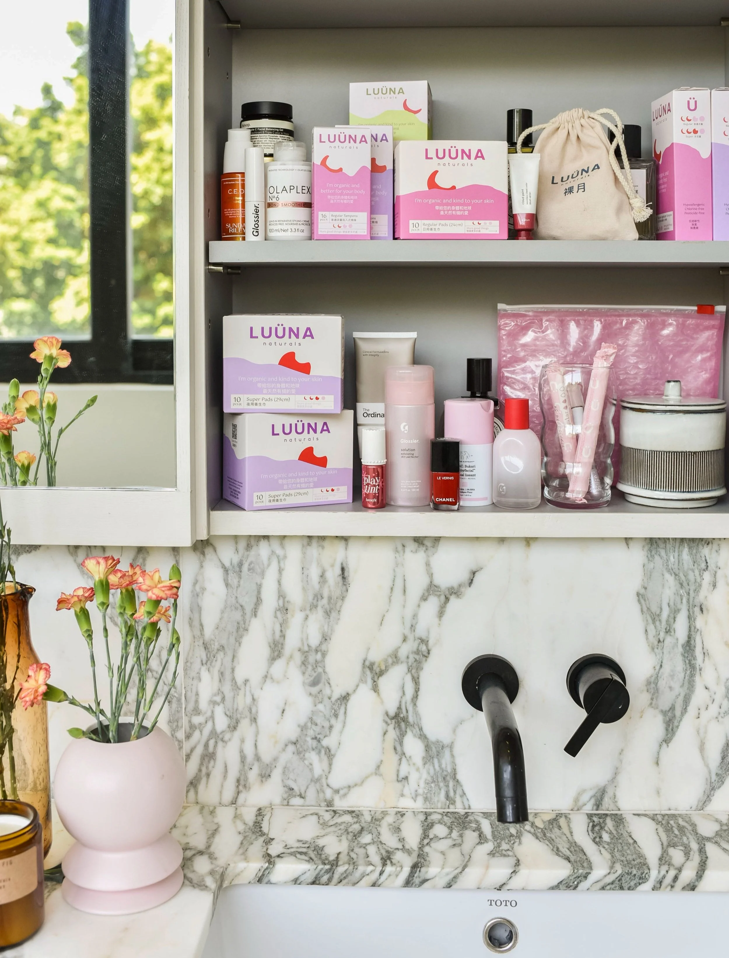
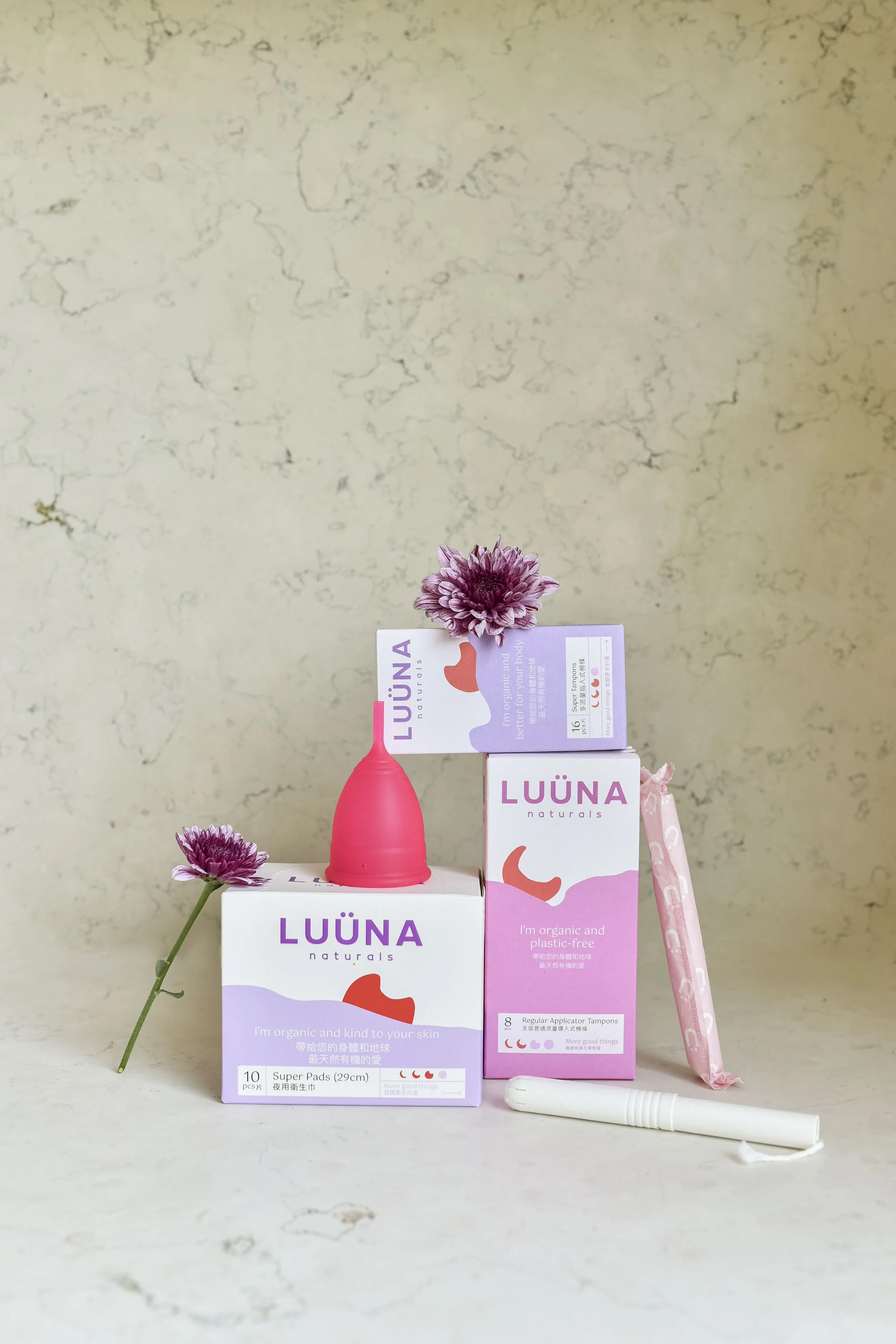
COLOUR PALETTE
The previous colour palette had bright neon colours, which were very youthful and expressed a ton of energy, but unfortunately lacked in providing credibility while doing so. I also didn’t want to introduce colours that blended well with their existing products. In the new colour palette, I wanted to still maintain the youthful aspects but calm the overall energy.
以前のカラーパレットは、鮮やかなネオンカラーを使用しており、非常に若々しくエネルギーに満ちた印象を与えていましたが、信頼性には欠けていました。また、既存の製品との調和を意識した色を導入したくはありませんでした。新しいカラーパレットでは、若々しい印象を維持しつつ、全体的なエネルギーを落ち着かせることを目指しました。


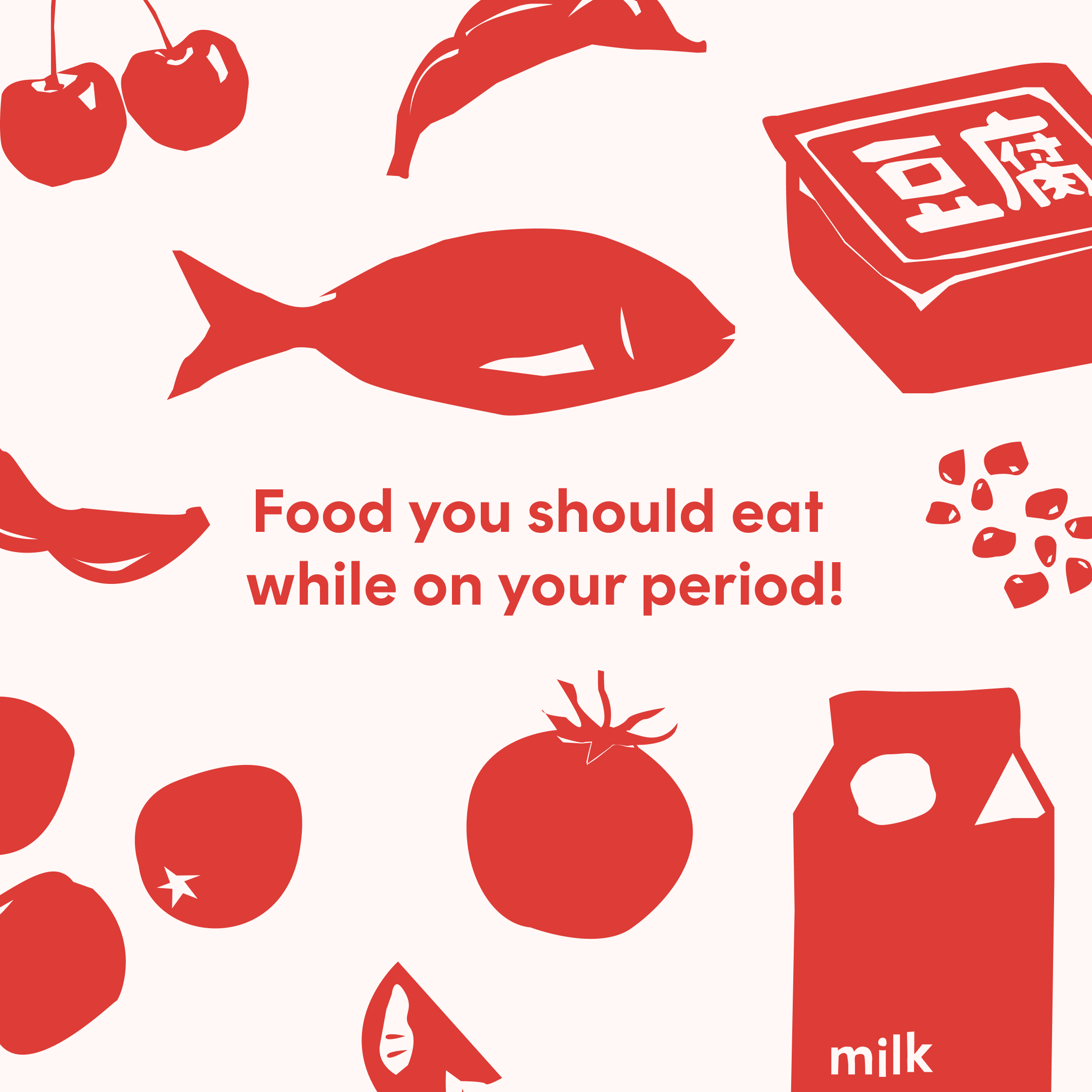
SOCIAL MEDIA CURATION
As part of their goal to become more credible and trustworthy, whilst still having elements of fun, I implemented infographics into their social media but was mindful to avoid being too text-heavy. I wanted to achieve a balance between maintaining the fun persona and infographics.
より信頼性と信憑性を高めつつ、楽しさを保つという目標の一環として、ソーシャルメディアにインフォグラフィックを導入しましたが、テキストが多くなりすぎないように注意しました。楽しさのあるキャラクターとインフォグラフィックのバランスを取ることを目指しました。


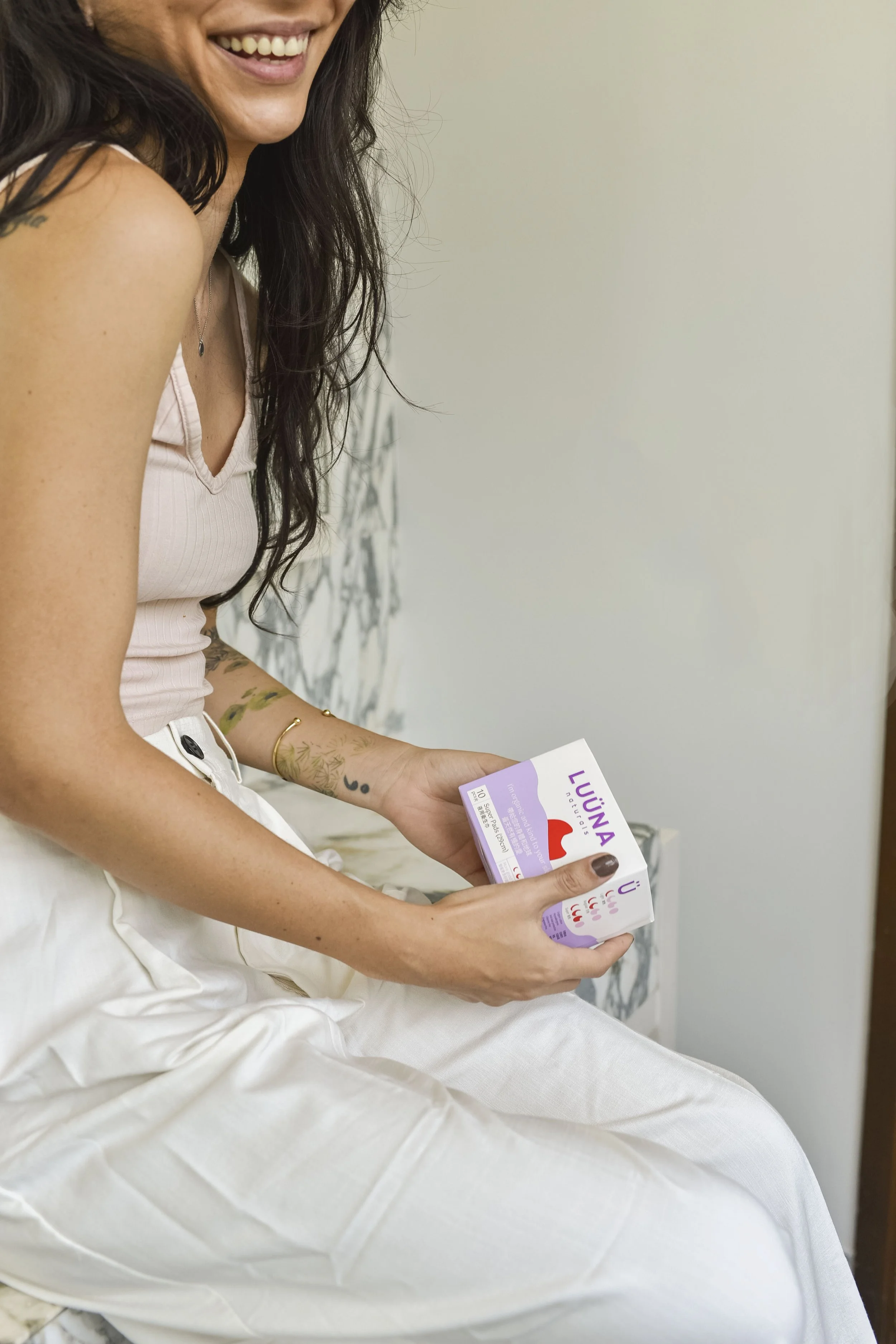
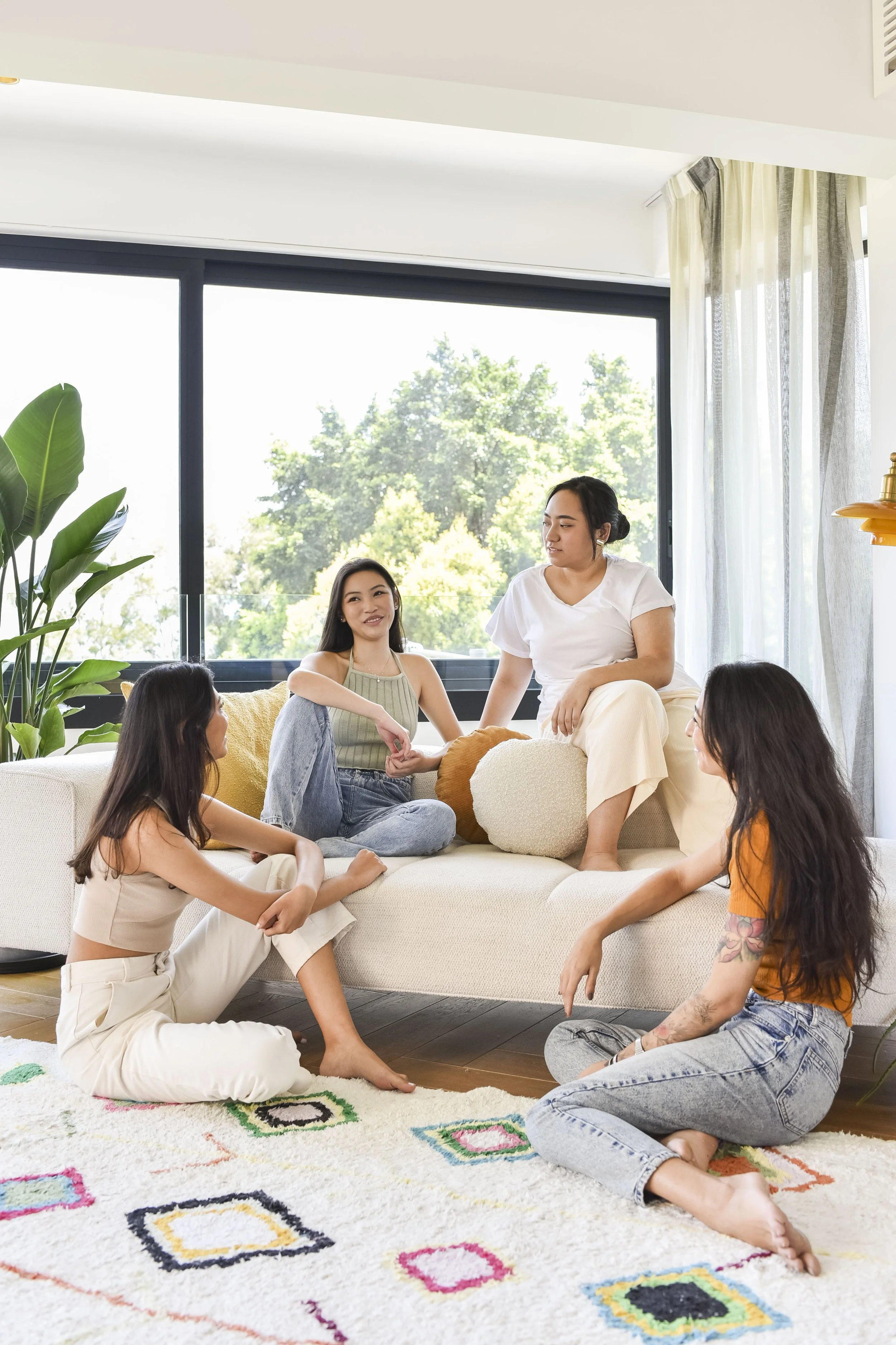
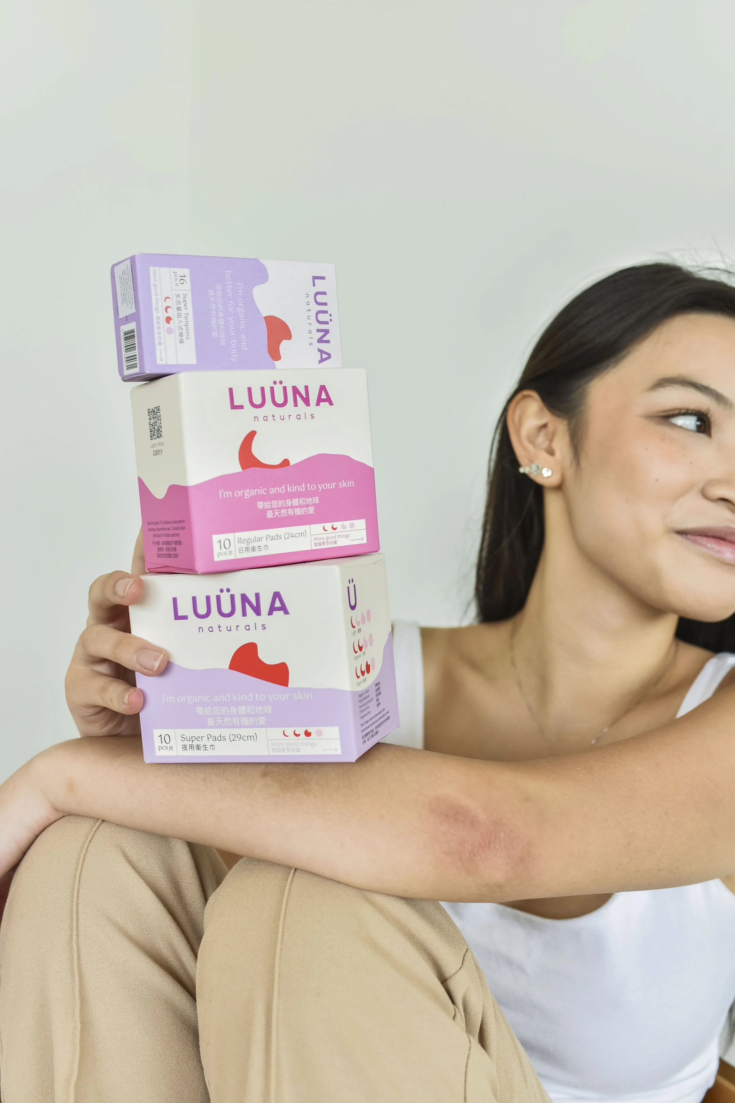
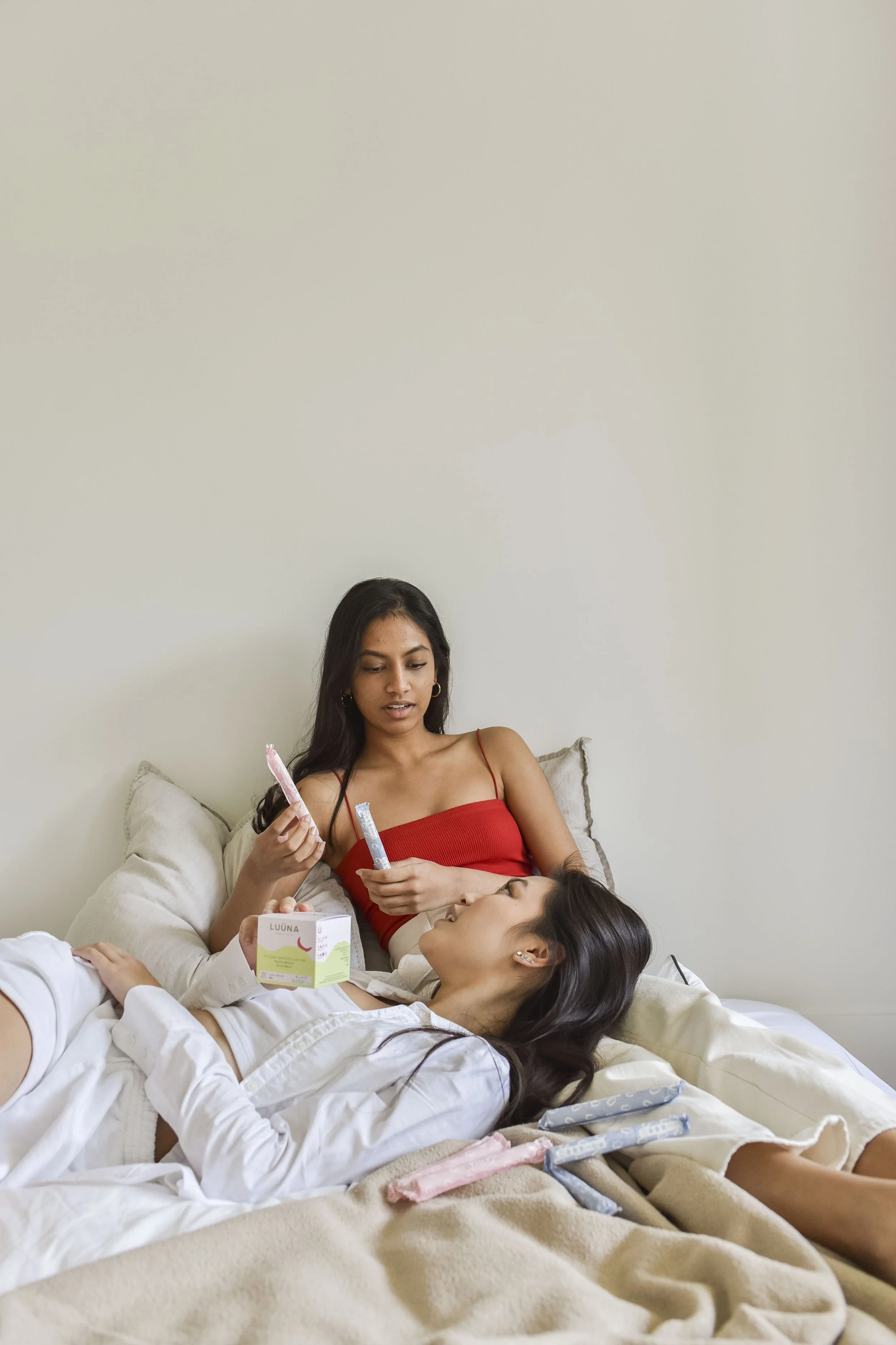
BRAND CAMPAIGN SHOOT
Aided in pre-production; shot list curation, styling, and art direction. Took charge of shortlisting image selections and directed post-production editing.
プリプロダクションをサポートし、ショットリストの作成、スタイリング、アートディレクションを担当しました。画像選定を主導し、ポストプロダクションの編集を指導しました。
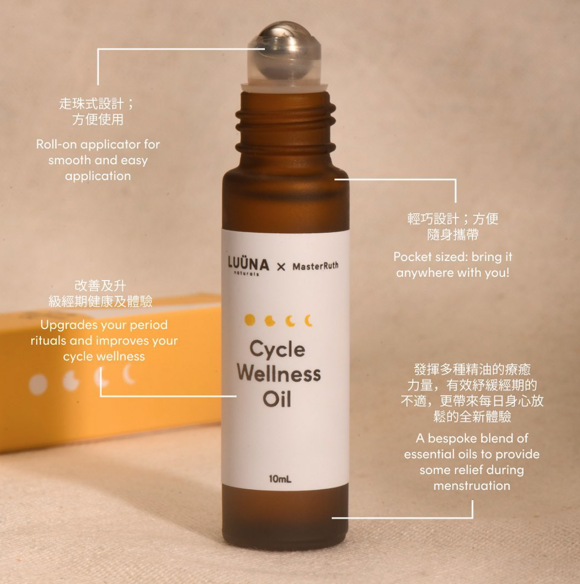
CYCLE WELLNESS OIL CAMPAIGN
Led overall art direction and post-production editing.


Email Marketing Campaigns
Designed eDM campaigns and templates for clients to use via Klaviyo.
Klaviyoを使用したメールキャンペーンおよびテンプレートのデザインを行いました。
E-commerce imagery shot by Tory Ho
Campaign imagery shot by Cammie Warburton
Cycle Wellness Campaign shot by in-house photographer via Constant